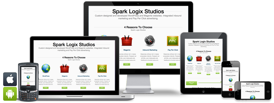
Profit from 'Responsive Web Design'. Create a single optimized website for mobiles, tablets, desktops and laptops. Increase your website reach, increase sales / conversion, and save cost.
As more and more people are accessing the internet using mobile devices there is an increasing need for websites to adapt to wide range of devices, from large desktop computer monitors to mobile phones and tablet devices.
Earlier, when web designers wanted to reach all those devices people used to access Internet, they were forced to create a different versions of a website for each device they wanted the website to be accessed from. Today, web designer use responsive web design to help circumvent this problem which allows a web designers to create a single site that can be implemented across devices.
Responsive web design is a web designing technique that utilizes scalable images and self adjusting layouts that help webpage adapt to the devices that is accessing it.
As tablet and smartphone sales are exploding, a website designed using responsive design has become increasingly important, as content consumption on mobile devices will only continue to increase.
Responsive web design allows creating a single website design that automatically adapts to multiple devices with different screen resolutions like in mobiles, tablets, and PCs. This approach not only saves cost of creating and mantaining multiple websites for each device but also allows websites to reach more people who use tablet and mobiles.
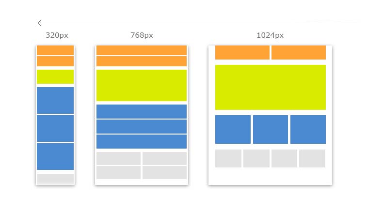
Following diagram depicts how a responsive web design layout adapts to various devices on which the website is being viewed, having different screen resolution.
Advantages of Responsive Web Design
Please fill this form to enable us quickly provide you our cost estimates for your website designing requirements
