Responsive websites responds to their environment
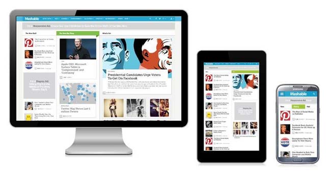
Responsive web design allows creating a single website design that automatically adapts to multiple devices with different screen resolutions like in mobiles, tablets, and PCs.
This approach not only saves time and cost of creating and mantaining multiple websites for each device but also allows websites to reach more people who use tablet and mobiles.
Responsive web design is a web designing technique that utilizes scalable images and self adjusting layouts that help webpage adapt to the devices that is accessing it.
As tablet and smartphone sales are exploding, a website designed using responsive design has become increasingly important, as content consumption on mobile devices will only continue to increase.
Advantages of Responsive Wed Design
Responsive web design represents a fundamental shift in how web designers would build websites for the decade to come. As it allows creating a single website design that automatically adapts to multiple screen resolutions in mobiles, tablets, and PCs, such a design approach offers great benefits:
1. One Website for all devices
Traditionally web designers would serve a device specific version of the website to users by simply re-directing a mobile users to a device-specific site. But now responsive web design technique has solved this problem allowing web designers to create a
single site that can be implemented across devices.. Website designed with this technique automatically adapt to the devices that is accessing it without requiring customization of images or code.
2. Significant time and cost saving
Since only a single website need be created that adapts to multiple screen resolutions in mobiles, tablets, and PCs, a responsive web design approach results in saving unnecessary cost of creating and managing / maintaining multiple websites for each device.
3. Increases reach to tablets and mobile audiences
With the explosive growth of tablets and mobile phones, more and more people are accessing Internet from mobile device like tablets, phablets and smartphones. The demand for media-rich mobile internet and apps is burgeoning. By some estimates, some 40% Internet users now search and browse the net completely on mobile devices. Creating one single website that seamlessly adapts to all kinds of devices will certainly enabled such websites reach far more users than with a rigid website meant for desktop screen, or with different versions of websites for different devices, for that matter.
4. Increases sales and conversion ratio
Increased reach of the website offers potential of increased sales and conversion rates. Responsive web design delivers a consistent user experience across all screen sizes without requiring separate versions of the website, this would also have a positive impact on sales conversion rates.
5. Offline browing capability
With increasing number of users accessing Internet on the go on various mobile devices, offline browsing (without live internet access) is becoming increasingly important to web designers. HTML5, which is used in building responsive web design is equipped with offline browsing capabilities. Web designers and developers use application cache, to specify which files the browser can cache and use when the user is offline providing users full website experience even when not connected. User won’t even notice any difference between being offline and online.
Please fill this form to enable us quickly provide you our cost estimates for your website designing requirements